5 webshop design examples to inspire your luxury brand
Table of content
There is a reason why the adage warns, "Don't judge a book by its cover" — people do just that. However, you could make this tendency work in your favor by carefully curating your webshop design.
But, you should understand that webshop design is not merely about sleek graphics and motion effects. It is a crucial element that ensures your e-commerce site renders a user-friendly experience to create a seamless shopping experience. That way, customers won't think twice while reaching the final checkout process.
Read on as we relay the best webshop design practices, along with helpful tips on how to create a web design that converts.
Web design checklist for your e-commerce store
Whether you're using WordPress, Shopify, Woocommerce, Ecwid, or another site, without a clear roadmap, the webshop design process can easily be thwarted. So, here is a checklist that business owners and web developers can use to keep the process on track:
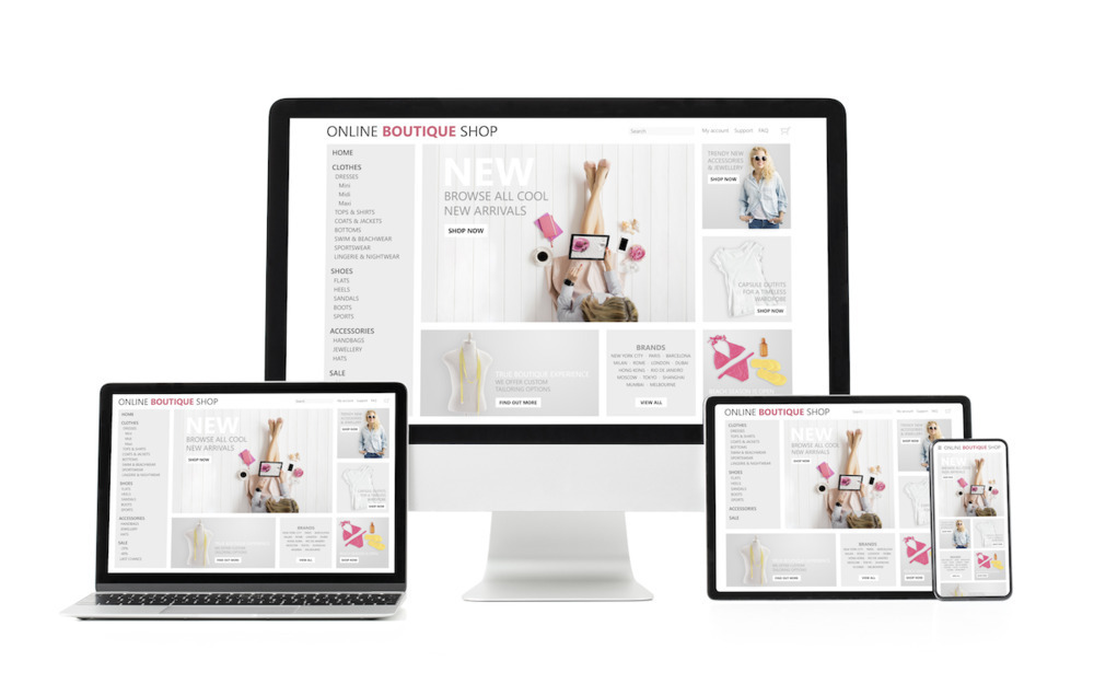
1. Home page
Just like how a brick-and-mortar storefront either attracts the customer to step inside or keep walking, your e-commerce home page can either cause a visitor to stay on your web page or move on to your competitor.
Readers only take 50 milliseconds to evaluate visual appeal, so you need to be strategic with your webshop design choice, especially on your home page.
Here are some of the best e-commerce website design elements to use on your home page:
- Hero image featuring an ongoing campaign or new products with a convincing call-to-action (CTA)
- Header with simple navigation to product categories and product pages
- Exit-intent pop-ups to increase visitor dwell time
- Sliders with product recommendations, products that reflect a browser's history, or trending products
Take Sephora as your home page inspiration. The cosmetic retailer has a spot-on home page design. It has a simple navigation header. The hero image features its product categories, and there's an exit-intent pop-up asking visitors to sign-up for its newsletter. This way, you can get users more familiar with your brand, build a rapport, and get them excited about your products.
2. About us page
Don't treat an About page as an afterthought. You lose business opportunities when you do not have an About page — 52% of buyers would like information on an About page.
While there is no one perfect way to nail the About content, a surefire strategy is to tell a story about your products or present your company values. Or as Tiffany & Co. does, you can talk about the history of your business and what you love about the industry, which creates an emotional connection with the user.
Pro tip: Keep the "about us" design elements in sync with your brand message. Don't have a sales pitch, but do use strategic CTAs as the jewelry retailer, Tiffany & Co. For instance, Tiffany has a section on its classic blue boxes that invites visitors to another page where they can shop for engagement rings.
3. Product page

Image credit: Baume
Your website builder ought to take immense care while developing your online store's product page. The product page is like a virtual sales assistant guiding visitors on an autonomous shopping journey. So, if your product listings look meh, the traffic you get will have a weak conversion rate.
That's not what we are aiming for. With the right webshop design for your product page, you should be able to convert as much of the traffic into sales.
Choose your color palette of your product page very mindfully. Believe it or not, your webshop design's color scheme can influence purchases. Niel Patel Digital claims that in a survey, 85% of shoppers said that their product purchases were influenced by the product color.
Additionally, you need to keep the product page aesthetics captivative and actionable. 42% of consumers judge an online shop simply on its overall design. And 52% never come back if the online store has a poor webshop design.
For design tips on how to use your product pages to drive sales, let's look at Baume & Mercier of the Richemont Group.
Firstly, Baume's product page only uses high-quality product photos. All the product specifications such as the name of the timepiece, size, color, price, and other important product descriptions are mentioned. And with 3D configurators and augmented reality technology, Baume takes the user experience to the next level.
Shoppers can customize the watches in real-time and visualize the product images in 3D with a 360-degree view. Once shoppers have designed their custom watch, they can virtually try it on. What's more, they can even take a pic of how the newly designed piece looks on their wrist and share it on social media to get the feedback of family and friends.
Using 3D configurators, virtual reality, and augmented reality can go a long way in enabling luxury e-commerce businesses to accelerate the sales cycle.
4. Product category landing pages
E-commerce businesses generally have a variety of products. To facilitate discovery, your webshop design must have a category page. You can either use the templates you find in your e-commerce platforms or build pages from scratch. But either way, ensure that the category pages will help customers quickly find the products they desire.
At this point, you should note that the category pages must also use SEO (search engine optimization) strategies. Duplicate product content and irrelevant, incorrect product parent-child relationships can lower your rankings in organic search. After all, to stand out to your visitors, your visitors have to find you. That means you need descriptive, SEO-friendly content and URLs.
Keep the typography consistent and fit the overall information architecture logically. Do allow visitors to use filters for sorting product suggestions.
Take Kohl's category page functionality as inspiration. It has a minimalist webshop design and is created with the user in mind. Its Bed and Bath product category page, for instance, shows visitors immediately where to find the products they need.
5. Checkout page

Image credit: Edenly
Unfortunately, according to Baymard, "69% of all e-commerce visitors abandon their shopping carts." This happens for a variety of reasons, most of which can be prevented by improving the checkout page's flow and feel.
Allow first-time shoppers to use guest checkout_._ Post completion of the purchase you could prompt them to register an account with you. Another option here is to allow social logins — shoppers can log in via their Gmail or social media profiles.
This is important because it makes the registration process quick for the shoppers and helps the e-commerce businesses check the data given easily. And another reason to have social logins — 77% of users demand them.
Courbet has an excellent checkout page. First, it allows shoppers to customize their rings. But in real-time, with every customization they make, the pricing also gets updated. Until this, it does not send pop-ups to create an account. Only when the customer presses the "Add to Cart" button does Courbet prompt the user to sign-up either with their email and unique password or with a social login.
Delaying the sign-up prompt helps Courbet to buy the time it needs to make the buyer fall in love with the custom jewelry piece they’ve created.
Secondly, reduce the number of fields on the signup page. On average, e-commerce website templates have approximately 12.8 fields in the checkout flow — this lengthy process scares potential customers. Reduce it to six or five fields and keep a mobile responsive design as well. And finally, list all the payment methods that you accept — whether it's a debit or credit card, or PayPal or Amazon Pay or Apple Pay. All these steps together can help reduce cart abandons.
How to create the best webshop design
The features of a good webshop design can be classified into four elements:
- Customer trust in your online business built through your Home and About page
- Engaging, relevant site design and graphic design
- Easy online shop navigation
If you can keep these in mind while designing your e-commerce store, you can convert more visitors into customers. And always keep the user experience as your top priority. Don't shy away from using advanced technologies such as product configurators and immersive, interactive shopping experiences rendered by AR and VR.
Feel free to connect with Apviz to get started on these eCommerce sales tools for your eCommerce business.
By Yahong Zhang - Wed May 26 2021